Advertising: Keep it Simple, but with Soul

 I’m all for simplicity in advertising, especially in aerospace. In our industry, simple messaging and graphics stand out because they are unique, unexpected, and, well, genuinely refreshing. But simplicity alone isn’t enough.
Two ads especially caught my attention in the January issue of Rotor & Wing. The first had a strong headline: “More Technologies. More United,” and informed readers that Goodrich and Hamilton Sundstrand are now part of UTC Aerospace Systems. The ad successfully conveys the intended message, but it has no soul. It fails to evoke any emotion or give viewers a sense of “who” this new company is, and that’s too bad. The graphics, though simple, don’t support the message or evoke any response, except maybe a yawn, in the viewer.
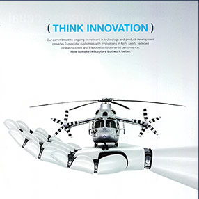
American Eurocopter’s ad features a generous amount of white space, along with the headline “Think Innovation.” The graphic — a helicopter resting on a high-tech robotic hand, delivers the message quickly and clearly so viewers “get it” immediately.
Do your ads pass the “simplicity with soul” test? It’s a question worth asking.
