Get Inspired: 5 Good A&D Websites
 We’ve written extensively about the importance of having a robust, user-friendly website. The website is where your buyers will start the process of connecting with you, it’s the front door to your business, and it’s the hub of your entire marketing program. No pressure, but you have to get it right — and it all starts with your homepage.
Hubspot put together a great article about what makes a good website and explains that the most brilliant homepages have all or most of these 7 qualities:
- Clearly answers “Who I am,” “What I do,” and/or “What you (the visitor) can do here”
- Resonates with the target audience
- Features a compelling value proposition
- Offers great navigation, usability, and mobility
- Includes calls-to-action (CTAs) to guide visitors to the next logical step
- Is always changing to reflect the needs, problems, and questions of its visitors
- Has a great overall look and feel
With these guidelines in mind, we thought it would be helpful to provide examples of aviation, aerospace and defense companies that are checking all the boxes for making a great first impression online. It’s not too surprising that there are only a couple of true B2B businesses represented in our top picks. The truth is that there is lots of room for improvement in this segment, with B2C enterprises generally being one very big step ahead.
Use these sites for ideas, inspiration and to gain a better understanding of what works. Here are BDN’s picks for the best of aerospace industry websites.
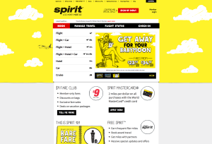
If you’re looking for inspiration, look no further than Spirit. Spirit’s marketing is top-notch across-the-board, so we expected nothing less online. Their clear and simple value proposition is front and center, and the site oozes personality and charm. The homepage provides clear tools that describe how Spirit works, and presents its pricing in a clear, easy-to-understand way. Unique colors, bold graphics, animation, and compelling calls-to-action pull everything together.
This site isn’t perfect or sexy, and it’s not breaking any new ground. But it’s doing a lot of things right, with a simple and direct value proposition, clear calls to action on the home page (Shop Fixed Wing, Shop Rotor Wing, Shop Engines/APU) and easy-to-find information about the aircraft and manufacturers Able supports. Need a part? Just use the simple search function. It’s a lot of information that could easily be overwhelming, but it’s not.
Clean, clever and classy, this site is completely in keeping with the Embraer brand and buyer. While we’d like to see gated content and more prominent calls to action, the aircraft comparison and range circle features are engaging and helpful, and the overall design is a breath of fresh air.
Like Spirit, the guys and gals at Gogo are masters of marketing, and their website reflects that understanding and expertise. Sure, it’s predictably aviation blue, but its uncluttered design and punchy messaging are atypical. Four oversized calls to action dominate the home page, and we love the way the navigation is built around buyers, and not the company or its products.
Quality imagery? Yes, please. Minimal but evocative copy? Love it. Stunning visuals take center stage here and underscore the importance of investing in the best possible photography. The eye candy invites the visitor to spend time exploring before taking a deeper dive for details about features, benefits and specifications. It’s an effective approach that’s unusual for our industry. The call to action is straightforward and easy to find – “Buy A5.” This website is proof that less is more, and we wish more industry sites would follow suit.
Bonus picks
At the risk of self-promoting, we think there’s a lot to learn from these BDN-developed sites, too:
Though there is a clear call to action, this website really isn’t about selling in the traditional sense. Instead it’s about storytelling, building credibility and generating excitement. BDN accomplished these goals with a fluid design where each page is one chapter in a larger story. Notably the site provides access to a media section. Hosting the latest news helps build credibility, and showcasing the impressive list of outlets that have featured the company enhances the brand. A regularly updated blog is part of the overall marketing strategy while also improving SEO and actively generating leads.
This site is all about giving buyers tools and information they need to drive preference and decisions while also serving as an important tool and force multiplier for the sales team. There’s a ton of downloadable content, including case studies, infographics and white papers, all with frequent calls to action. The straightforward navigation and modern design are refreshing, too. The strategically placed gated content and forms deliver hot leads to sales while providing valuable insight into the audience’s areas of interest. A portal for sales reps hosts an array of easily accessible tools.
It’s important that we practice what we preach, so BDN recently overhauled our own website to function with a clear goal of sales enablement. To learn more about how this lead generation effort is working for BDN, request a copy of our case study here
