Critiquing An Aerospace Advertisement: Russian Helicopters Ka-62

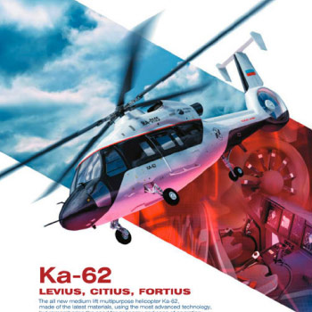
 I thought I’d take a look at an ad from a relative newcomer to the western markets, in particular an ad for the Ka-62 helicopter from Russian Helicopters.
In Monday’s, I talk about how an ad must perform three tasks, in succession, to be effective: cause the reader to see, understand, and feel.
To see the ad means to stop long enough, in flipping pages or pixels, to take an interest in what might be represented.
The Ka-62 ad does that for me. It is populated with elements that are arranged to clearly indicate the nature of the ad — it’s about a helicopter. A dynamic view of a helicopter, a bold and clear headline (simply the name of the product), and obviously enough copy to suggest I may learn something, but not so much that I’m afraid to venture into reading it. I’m intrigued and willing to take the next step: spend a few moments deciding if I can learn something of value.
Could the graphics and copy have led to an ad about training, or support, or ITAR issues, or insurance? No. The background image of the flight deck, and the tail rotor, and some other murky effect or graphic, all blended together, is not entirely clear in what is being offered, but the aircraft on top, pointing to the headline, prevents confusion.
What is a little confusing is the subhead: levius, citius, fortius. I assumed it to be Latin, and figured it was interesting, but with a poor comprehension of the language, I felt a bit ignorant. That feeling could have been ameliorated if the body copy provided the translation but it didn’t and so, right where you, ad creator, want to be creating understanding, you have placed a stumbling block. (By the way, it translates to smoother, faster, stronger; reasonable but pretty much wasted by presenting it in a dead language.)
The body copy is otherwise fine. Nothing fancy, and a little vague in its claims, but sufficient to add to my understanding of the product and leaving me with enough questions to be interested in learning more. Maybe not now, by calling or emailing or even typing in the URL, but on my radar to be alert for other ads, stories, press releases, etc.
So, did my seeing and understanding lead to a change in my feelings? Yes.
I knew almost nothing about the product, and now I’m primed to learn more as the opportunities present themselves. I feel better about the company, too, because the graphics and the writing were appropriate to the marketplace and rewarded me for the time I spent. If more ads from Russian Helicopters support this style and approach, I will be open to spending time with those ads. And if other media from them support the same brand image, it will strengthen their brand in my mind. And even if I determine this product is not for me, other offers from them will be viewed with an accepting eye.
Mission(s) accomplished.
