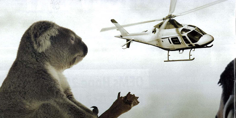
Critiquing An Aerospace Advertisement: AugustaWestland

 Dear AgustaWestland,
Nothing about this ad makes sense to me, so I am assuming it was designed by a committee. Most likely it was a last-minute endeavor, and perhaps this was the only thing everyone could agree on, but your customers and employees deserve better. Your helicopters deserve better. And your brand deserves better. Heck, even the koala bear deserves better.
The most effective ads are simple, but layered with meaning. They don’t have to be literal. But they do need to artfully combine words and images to connect and communicate with readers, and they must tell a story that your audience cares about. Great ads are often deceptive in their simplicity, because they appear to have been created effortlessly. They trick you into believing anyone can do it. So you start out with a lofty vision and a great idea, then somehow end up with a bear, a helicopter and a cockpit.
Marrying the right idea with the proper imagery, inspired copy, and flawless execution isn’t easy.
I don’t mean to pick on the nice people at AgustaWestland — I have friends there. No one knocks it out of the park every time. But this particular ad, quite honestly, is more than I can bear.
Over to you, folks. Am I off base here?
