Category: Marketing Ideas
Get On Board: Introduction To Whiteboard Videos
 I’m suddenly obsessed with white board videos as a great way to tell technical stories in a quick, concise and eminently watchable way. We’ve all seen too many traditional, snooze-worthy corporate videos. They are a big investment, but if they are not masterfully produced they do little but bore the audience and clearly convey that your company is boring, too. They are not being used much in aerospace marketing yet, though our friends at Able Engineering were among the first, and we love the end result.
Some people might worry that a white board concept is too edgy or cartoony for our industry, but it’s not. Heck, the United States of America has branded a “White House White Board” online to explain potentially daunting topical issues (note to President Obama: lose the talking heads).
If you have not yet seen or experienced a white board video, start with a Google search and start exploring. They’re all the rage, and, well, we’re on board.
Advertising: Keep it Simple, but with Soul
 I’m all for simplicity in advertising, especially in aerospace. In our industry, simple messaging and graphics stand out because they are unique, unexpected, and, well, genuinely refreshing. But simplicity alone isn’t enough.
Two ads especially caught my attention in the January issue of Rotor & Wing. The first had a strong headline: “More Technologies. More United,” and informed readers that Goodrich and Hamilton Sundstrand are now part of UTC Aerospace Systems. The ad successfully conveys the intended message, but it has no soul. It fails to evoke any emotion or give viewers a sense of “who” this new company is, and that’s too bad. The graphics, though simple, don’t support the message or evoke any response, except maybe a yawn, in the viewer.
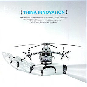
American Eurocopter’s ad features a generous amount of white space, along with the headline “Think Innovation.” The graphic — a helicopter resting on a high-tech robotic hand, delivers the message quickly and clearly so viewers “get it” immediately.
Do your ads pass the “simplicity with soul” test? It’s a question worth asking.
Aerospace Advertising: How to Grab Attention
 No matter the stated goals of an ad, to be effective it must accomplish three things — capture the viewer’s attention, communicate the desired facts or attitudes, and cause the viewer to feel how what they’ve learned is important and desirable and how a future with the advertised product or service or position will be a better future for them.
See, understand, feel.
If the ad does not grab attention, if it is skipped over, ignored, or even actively avoided, there will be no step two.
How can you grab attention? Graphics are often the tool of choice — a photo or illustration that draws the eye, colors that stand out (bold, subtle, different, non-existent), a composition that causes a pause. But a sufficiently bold (in design or sentiment) headline can perform the same function.
Once grabbed, the viewer’s attention must be rewarded. There should be an appropriate connection between what caused the pause and the next level of engagement. While there is often descriptive or narrative copy, it is not a requirement and might even be a crutch, supporting an otherwise pointless or uninteresting message. An image might communicate all that is required. Or text might be unaccompanied by other graphics. Or somewhere in between.
Remember, the point of all the effort to write, design, and otherwise produce this bit of commercial art must be a change in perception. Such changes are greatest when the ad supports the brand image that is developed across all media and touch points, and leads to the viewer believing that their future will be better with the product or service communicated in the ad. It’s as simple as that.
Simple to state, perhaps, but not simple to execute.
Perhaps the first step is easily judged — does the ad stop the viewer long enough to allow for step two? This requires evaluating the ad not just in itself, but also in context. How does the ad fit with, or stand out from, the editorial, graphics, layout, and other advertising that surround it and otherwise comprise its milieu? Other parts of the magazine? Other ads in that market space? The general graphic sensibility of the times?
And if it stops the viewer, does the ad impart important information? Does it communicate why this product/service/action is superior to others on offer or, perhaps even better, why the offer has no competition and is desirable in and of itself?
But most importantly, does the information transform a viewer’s vision of their future? Does it make the viewer feel? That is the ultimate and singularly relevant question.
So, whether you are creating or judging an ad, be honest with yourself — does it make the viewer see, understand, and feel? If it does, it is working.
If it doesn’t, it’s a waste of money.
Critiquing An Aerospace Advertisement: Russian Helicopters Ka-62
 I thought I’d take a look at an ad from a relative newcomer to the western markets, in particular an ad for the Ka-62 helicopter from Russian Helicopters.
In Monday’s, I talk about how an ad must perform three tasks, in succession, to be effective: cause the reader to see, understand, and feel.
To see the ad means to stop long enough, in flipping pages or pixels, to take an interest in what might be represented.
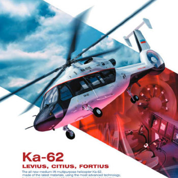
The Ka-62 ad does that for me. It is populated with elements that are arranged to clearly indicate the nature of the ad — it’s about a helicopter. A dynamic view of a helicopter, a bold and clear headline (simply the name of the product), and obviously enough copy to suggest I may learn something, but not so much that I’m afraid to venture into reading it. I’m intrigued and willing to take the next step: spend a few moments deciding if I can learn something of value.
Could the graphics and copy have led to an ad about training, or support, or ITAR issues, or insurance? No. The background image of the flight deck, and the tail rotor, and some other murky effect or graphic, all blended together, is not entirely clear in what is being offered, but the aircraft on top, pointing to the headline, prevents confusion.
What is a little confusing is the subhead: levius, citius, fortius. I assumed it to be Latin, and figured it was interesting, but with a poor comprehension of the language, I felt a bit ignorant. That feeling could have been ameliorated if the body copy provided the translation but it didn’t and so, right where you, ad creator, want to be creating understanding, you have placed a stumbling block. (By the way, it translates to smoother, faster, stronger; reasonable but pretty much wasted by presenting it in a dead language.)
The body copy is otherwise fine. Nothing fancy, and a little vague in its claims, but sufficient to add to my understanding of the product and leaving me with enough questions to be interested in learning more. Maybe not now, by calling or emailing or even typing in the URL, but on my radar to be alert for other ads, stories, press releases, etc.
So, did my seeing and understanding lead to a change in my feelings? Yes.
I knew almost nothing about the product, and now I’m primed to learn more as the opportunities present themselves. I feel better about the company, too, because the graphics and the writing were appropriate to the marketplace and rewarded me for the time I spent. If more ads from Russian Helicopters support this style and approach, I will be open to spending time with those ads. And if other media from them support the same brand image, it will strengthen their brand in my mind. And even if I determine this product is not for me, other offers from them will be viewed with an accepting eye.
Mission(s) accomplished.
Developing Honest And Effective Messaging
 Are you writing/designing/exhibiting/strategizing to reach and engage your intended audience of prospects in the most effective ways possible? Or are you doing what is expected and what you believe you can sell internally?
If you are developing communications for the boss you are missing the mark — and missing a great opportunity to demonstrate expertise and deliver a marketing program that really works.
Successful marketers are fearless and confident. Are you? Tell the truth, or Santa will leave you a lump of coal.
The True Cost of Creativity
 Except for the very smallest of jobs, creative fees are always a small fraction of total costs (printing, media, etc.). The incremental difference between having professional, outside support or not will typically only increase costs from 5 to 10% on a small brochure or ad, and less than 1% on an annual report or multi-page web site. When the true costs of internal preparation — salaries, overhead, lost productivity— are added up, outside services nearly always cost less, not more. What’s more, external specialists likely have more refined skills than internal resources. Viewed from the bottom-line perspective, a small additional investment in design and writing quality produces an ROI that is sure to warm the heart of even the toughest CFO.
Sincere thanks to Cameron Foote of Creative Business, who gave BDN permission to share his thoughts on the true cost of creativity.
Keeping Up With The Joneses: Analysis On B2B Marketing Spending
 How much are other B-to-B companies spending on marketing?
40% report marketing budgets of under $1 million
21% report marketing budgets ranging from $1 million to $4.9 million
17% spend $5 million or more
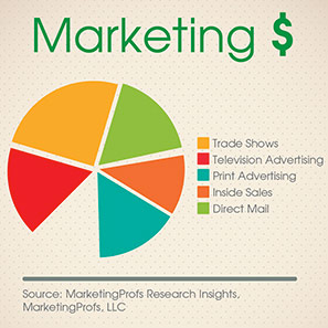
Where are they spending their money?
Trade shows: 20% of budget
Television Advertising: 17%
Print Advertising: 15%
Inside Sales: 14%
Direct Mail: 14%
This information was gleaned from a survey of dedicated marketing executives in B-to-B businesses with revenues ranging from less than $100 million (nearly half of respondents) to $1 billion or higher. 35% of respondents described their businesses as Manufacturing, High-Tech, and Primary Production.
How much are you spending? How does your budget measure up?
Source: MarketingProfs Research Insights, MarketingProfs, LLC


